
Just ask an artist: Color dictates how we perceive everything from interior spaces to the seasons and, of course, works of art. In the spirit of our annual home decor issue, we asked three creatives– a florist, an art historian, and an art teacher– about how they approach color in their own work, as well as how those principles can be applied to interior design.

Jimena Berzal de Dios
Art Historian at Western Washington University
Broadly speaking, what is color theory, and how do colors influence our perception of day-to-day life?
Color theory studies the nature of colors, how we perceive them, and how to use them effectively. We often think of colors’ associations with emotions, like red and passion. Another important factor is how much a color or combination over- or under-stimulates our senses. Both extremes create negative responses, even physical stress.
How has our perception of color and art changed over the centuries? Can you give a few examples of this phenomenon?
Color perception is both nature and nurture. Take blue: In psychological terms, our response to blue evokes tranquility, serenity, and safety. Nowadays these associations are used purposefully by many financial institutions in their logos. And yet, there’s “feeling blue.” We do not know exactly how this association originated. Geoffrey Chaucer wrote about “tears blue,” so the connection between emotional pain and blue has a long history as well.
You mention that you also have an interest in interior design! Does your home have a specific color palette, and if so, why did you choose it?
When I think about decorating, I don’t consider the psychological associations of a color, but rather the overall mood I would like to inhabit.
After my first year in Bellingham, I wanted an upbeat yet calm palette for my living room. I thought of the feeling of overlooking the Mediterranean sea, or the type of experience that the beach paintings of Joaquín Sorolla create. I already had a blue couch, but I was after something more specific those paintings evoke: the freshness, the sun, and the breeze.
I ended up creating that mood with greens and yellows–it was zesty, light, and fresh. There’s also something casual and carefree about a stroll on the beach, so I ended up using and painting ReStore building materials to create make-shift furniture, and I also reworked an old coffee table to look like driftwood. The Western library at the time was giving away old maps, and some ended up in a wall-to-wall collage that brought seas and mountains to the living room.

Emily Zimmerman
Director and Teacher at BellinghamART
As an artist and as an art teacher, what do you think the value of color is to what you do and how you instruct your students?
As an artist, color is everything! My style is very bright. I tend to use a little bit of all the colors. It’s so much fun! I think my art can look like I just went for it with color, but there is a lot of thought behind where each color goes. As an art teacher, I want kids to have the background knowledge to have fun with color and inject their own style. But knowing the fundamentals of color is what I try to instill – once they really know and understand them they can have fun!
Can you tell me about how specific colors or color combinations can change a piece of art or shift how it is created?
Color has the capability of evoking mood and atmosphere. For example, maybe you want to create a more calm, soothing feel– so you would steer clear of bright, saturated colors, and instead calm your colors with white or a complementary color. You can imagine how different a piece would be if painted in reds versus shades of blue.
One of our teachers here told me about a color theory project which illustrates this. Choose an outdoor scene and take a photo of it in the morning, at noon, and in the evening (this works better when it is not overcast). Now paint them. You will see how the colors and saturation of the colors changes throughout the day. By use of color, you should be able to portray the time of day.
As an artist, what have you found to be your most exciting work with color? Why?
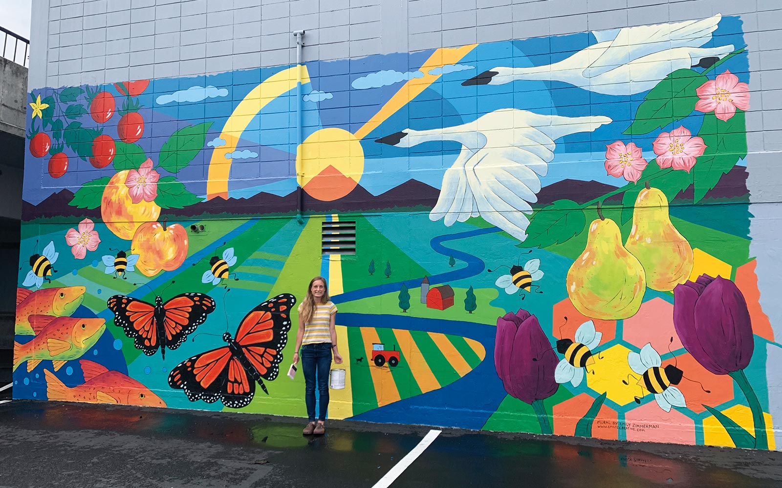
I have painted a few murals over the years and these are so fun to use color for! They can really change a space drastically! In 2020 I painted a mural at the Skagit Valley Food Co-op. We had a big, drab, gray wall in the parking lot, and we were going through a tough year (everyone was). So I went nuts with color.
It was so fun to see how much adding color to the parking lot made the whole place way happier and lighter. You could see some of the heaviness lifted from people when they walked by. I love that about color, and art in general. It has the ability to change how people feel. 1701 Ellis St., Bellingham, 360.738.8379, bellinghamart.com

Jodi Pears
Florist and Flower Gardener at Floralie Flower Farm
In terms of your floral services (bouquet subscriptions, workshops, full service weddings), what’s your philosophy on color?
I try to grow ingredients that complement each other and lend themselves to being cohesive.
I’m very inspired by nature and the season– the season that we are in will definitely lend itself to the products we grow, as well as the color palette.
How do you use color to create a specific ambiance or mood?
I am not afraid of color, and my overall aesthetic as a farmer florist has evolved throughout the years. I used to hate yellow, burgundies, and brighter colors, but I find that a pop of buttercream yellow or a warm peachy orange can really elevate a design. My designs usually convey a feeling of nature, femininity, and intrigue.
Do you have a color palette that you tend to gravitate towards in your work? If so, what is it and why?
It really depends on the season and the feeling I’m wanting to convey. I definitely lean towards airy, bright pastels in spring, whereas in fall I’m very drawn to rusts, earthy, or more moody tones. Saying that, I do think it’s possible to find either colors in either season. To me it’s most important to find ingredients that are actually in season where an event is being held to convey your message in the most sincere way.
What does your home look like? Does it have a specific color scheme?
I see my home as a blank canvas that I can add to throughout the seasons with florals, or adding a cozy blanket in the fall. Our home is a work in progress; we built it a few years ago. I knew I wanted mostly white so I could add all the special items to make it feel like home without feeling constricted to one color. (Editor’s note: Read our feature on p. # to see how Jodie’s florals accomplish this!) Custer, floralieflowerfarm.com